Fall Creek Area Foundation
A team of peers and I collaborated to rebrand a nonprofit organization based in Fall Creek, Wisconsin. Our goal was to attract a younger donor base while improving information accessibility for existing older donors. The project included the development of a new logo, website, flyers, and brochures.
It was important to apply Fall Creek’s communal environment and represent the foundation accurately. The symbol depicts a leaf in a simplified form, referencing the natural environment which plays a large role in a small town such as Fall Creek.
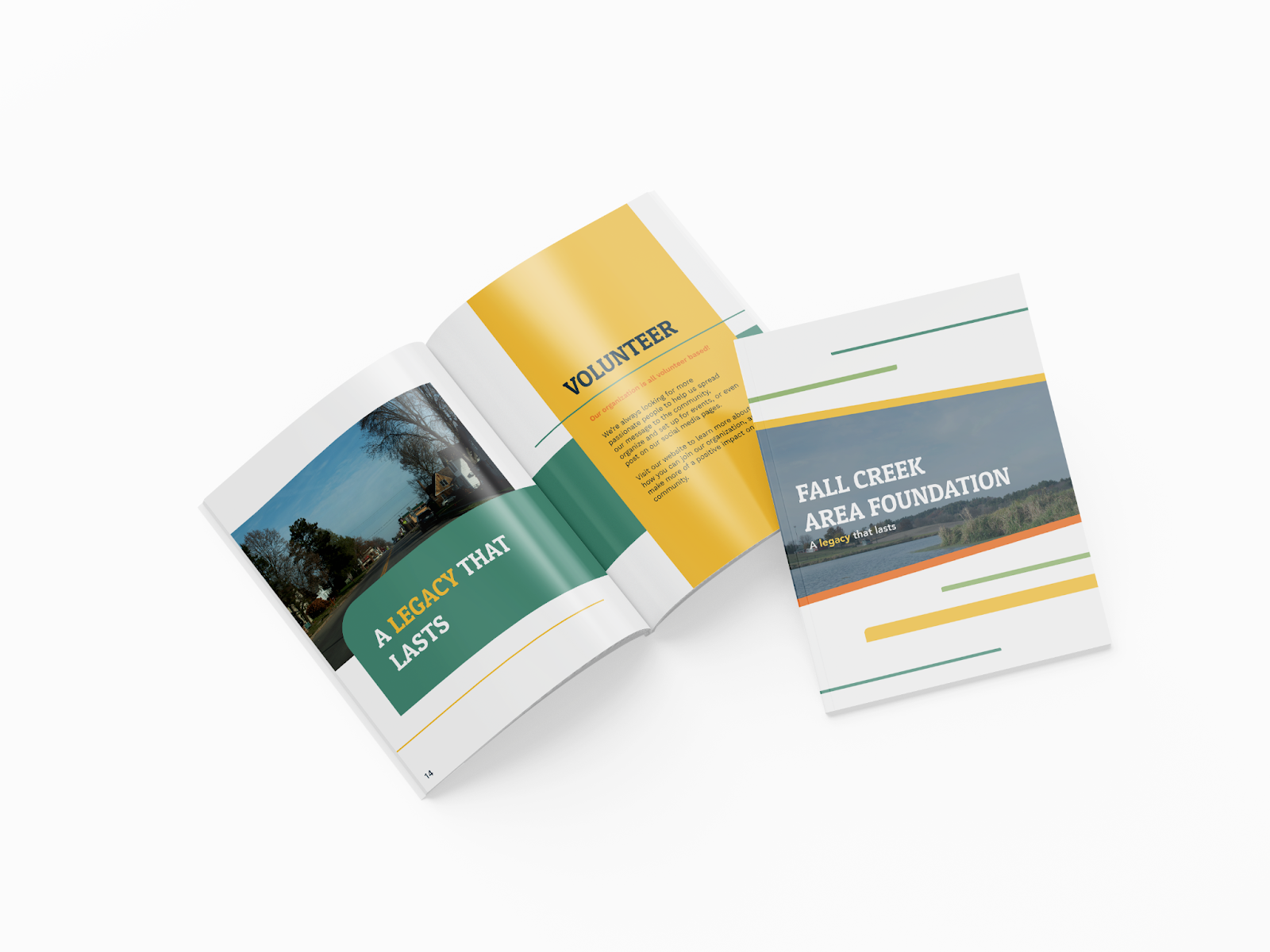
With the implementation of this informational booklet, the foundation will be able to reach the target audience as well as a more diverse audience effectively. The booklet makes it possible to spread information to the older generation who may not be comfortable with the internet or the website as well as act as an additional resource for other community members.
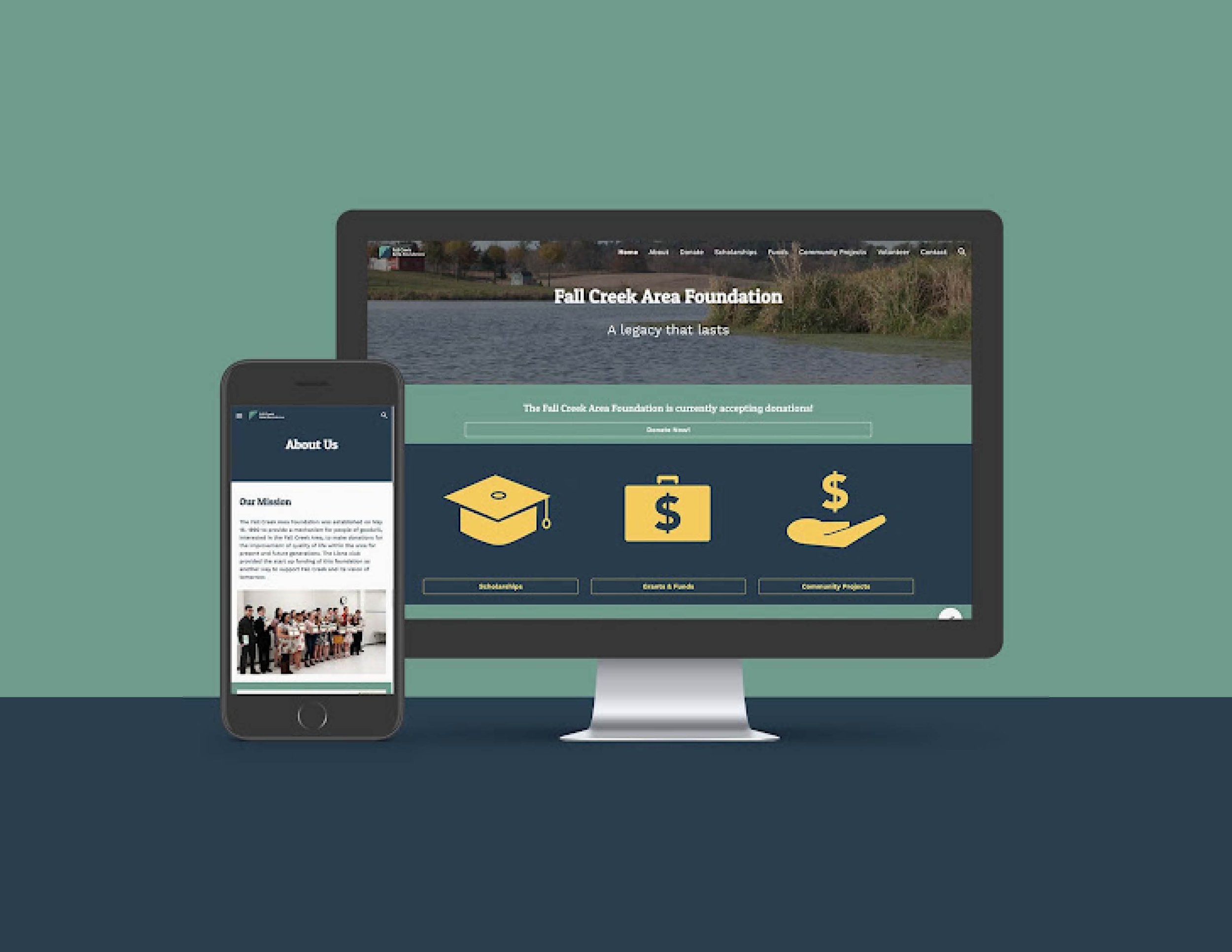
To reach more people with what you have to offer, it is important to have an easy to navigate website. Whether someone is wondering how they can help in the Fall Creek area, or they’re a local student searching for scholarship opportunities, visitors can locate this website and find the answers to their questions and their next steps. The same information was used that was already on the previous website, it is just organized in a more user-friendly way.
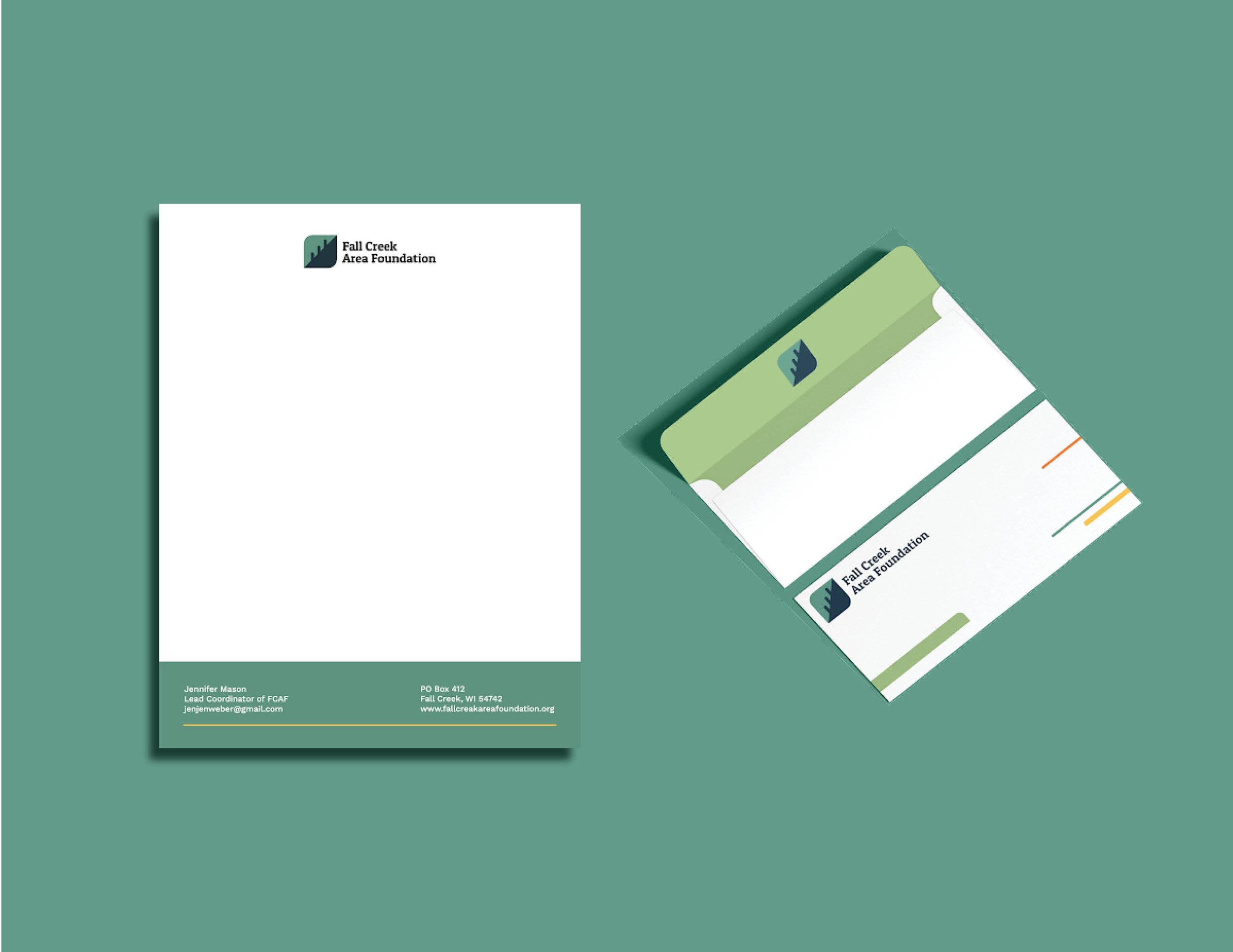
A branded envelope was created to set the tone of professionalism and competency before opening. A letterhead was established to be applied to documents as an introduction to the organization.
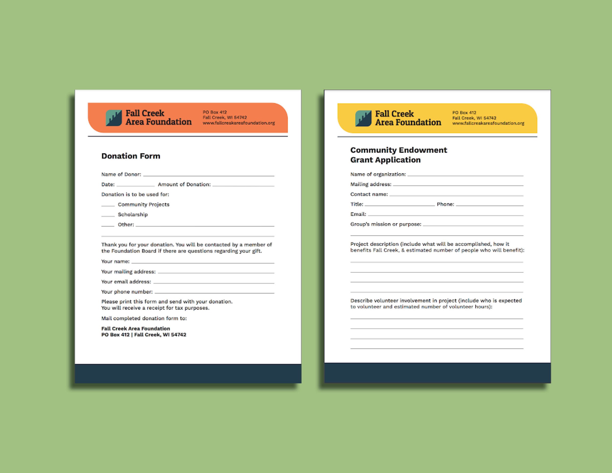
Additions were made to the donation form and the grant application by implementing the new logo and applying the brand colors for a more polished look.